This project has been updated, click here for part three (data enhancements) of this article.
After building the initial version of the Météo weather page and confirming that the data was all correctly handled I went about sprucing the UI up a bit.
Not only was the original design purely a functional one and not particularly attractive or user friendly but it was also missing a few key data points such as intra-day weather and likelihood of rain.
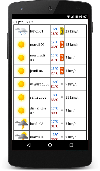
The Old UI
The tools
With the help of JQuery and the JQuery UI I managed to wrestle it into a usable and aesthetically pleasing look and feel.
I ended up using the JQuery Accordion without too much customization. This widget suits the website quite well as I wanted to be able to show an overview of the next 10 days at a glance but then allow the user to drill down into each day to see the intra-day forecast in more detail.
The final UI design
The accordion is closed upon first loading the website but then the user can tap each day to drill down and see more detail data.
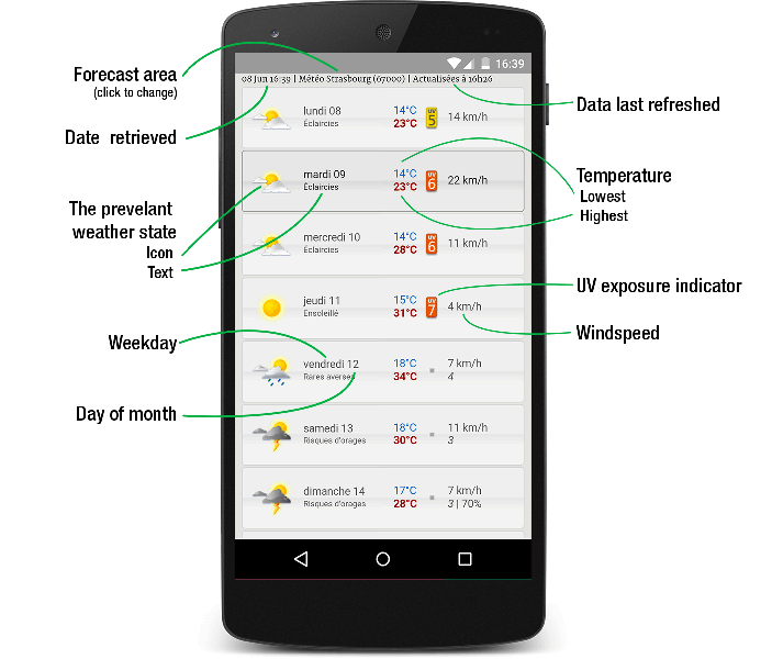
The initial view of the websiteAccordion is closed
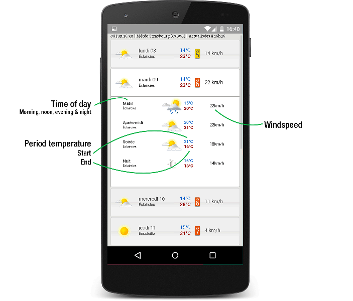
User has expanded a day and intra-day forecast is visibleAccordion is open
For longer term forecasts additional information is available on how confident the Météo weather model is about the prediction as well as a rough prediction of the likelihood of precipitation.
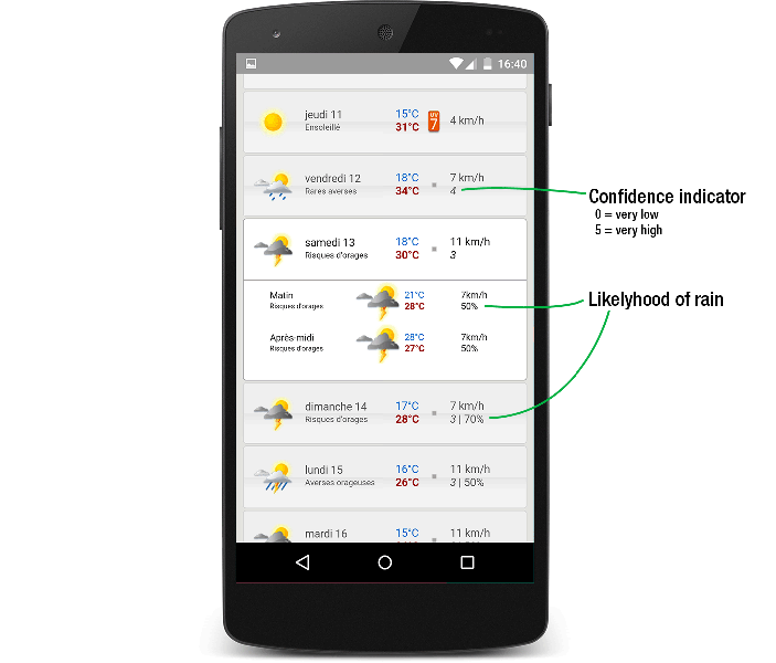
Extra data points are available for days further into the future
Customizing the forecast area
A new addition was the setup screen. This screen can be used to change the forecast area to a different city or area. This page is available by either clicking the name of the current area at the top of the page or scrolling all the way to the bottom of the page and clicking the "Configure" link.
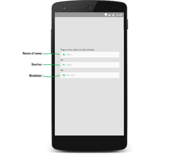
The Setup Screen
The user can type into one of the three textboxes
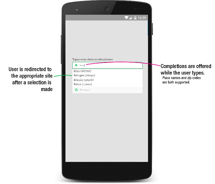
Suggestions are offered as the user types.
Both place names and zip code entries are supported
Feel free to try this forecasting site out and even bookmark it for future use.
This article is also available on LinkedIn https://www.linkedin.com/pulse/ui-upgrade-météo-mobile-weather-forecast-site-sverrir-sigmundarson
Developer & Programmer with +15 years professional experience building software.
Seeking WFH, remoting or freelance opportunities.